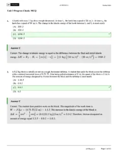
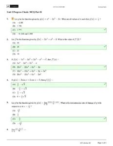
Biostatistics Record provides an in-depth exploration of biostatistics concepts essential for MBBS students in 2024. This guide covers data presentation methods, including tabulation and diagrammatic representation, to simplify data analysis. Key statistical tests, such as the t-Test for the Difference Between Means, are explained with formulas and examples to aid understanding. The document serves as a vital resource for medical students preparing for examinations and understanding biostatistical applications in healthcare research.

Key Points

  • Explains data presentation methods including tabulation and diagrams for effective analysis.
  • Covers key statistical tests like the t-Test for comparing population means with practical examples.
  • Discusses principles of data classification to enhance clarity and meaningful interpretation.
  • Includes detailed explanations of sampling techniques and their implications for research validity.
Sasi Tharoor
107 pages
Language:English
Type:Study Guide
Sasi Tharoor
107 pages
Language:English
Type:Study Guide
172
/ 107
The
objective
of
classification
of
data
is
to
make
the
data
simple,
concise,
meaningful
and
interesting
and
helpful
in
further
analysis.
There
are
2
methods
of
presenting
data:
1)
Tabulatien
2)
Diagrams
Tabulation
:
DATA
PRESENTATION
Is
the
first
step
before
the
data
is
used
for
analysis
or
interpretation.
"
In
the
process
of
tabulation
the
following
type
of
classification
are
encountered.
1)
Geographical
i.e
area
wise
2)
Chronological
i.e
on
the
basis
of
time
3)
Qualitative
i.e.
according
to
attribute
4)
Quantitative
i.e.
in
terms
of
magnitude
Principles
(in
tabulation
of
data)
:
1.
Every
table
should
contain
a
title,
should
be
concise
and
meaningful.
2.
The
tables
should
be
numbered
3.
The
heading
of
columns
or
rows
should
be
clear
and
concise
.eg:
ht
in
cm,
age
in
years
,
wt
in
kg
etc
4,
The
number
of
class
intervals
should
be
sufficient
to
condense
the
data
bringing
out
their
significant
features
.
5.
The
class
intervals
should
be
at
equal
width
6.
Uniform
size
class
intervals
are
preferable
7.
Sometimes
open
end
class
intervals
are
used
8.
The
class
intervals
should
be
clearly
defined
to
avoid
ambiguity
.eg-
0-4,
5-9,
10-14
etc.
9.
Units
of
measurements
should
be
specified.
10.
If
the
data
is
not
original,
the
source
of
the
data
should
be
mentioned
at
the
bottom
of
the
table.
11.
Groups
should
be
tabulated
in
ascending
or
descending
order.
12.
If
cetain
data
is
omitted
or
excluded
deliberately,
the
reason
for
same
should
be
given.
Ihe
class
intervals
should
be
same
through
out
table
except
in
case
of
age"
0-<1
(infant
up
to
1yr)"
1
4
(toddlers
1to
5yrs
but
not
completed
5
yrs)"
5-14
(
School
children
<
15yrs)
Presentation
by
Graphs
and
Diagrams:
Diagrams
and
graphs
are
extremely
useful
because
1.
They
are
attractive
to
the
eyes
2.
Give
a
bird's
eye
view
of
the
entire
data
3.
Have
a
lasting
impression
on
the
mind
of
the
layman
4.
Facilitate
comparison
of
data.
Basic
rules
in
the
construction
of
diagrams
and
graphs
:
1.
Every
diagram
must
be
given
a
title
2.
It
should
be
simple
3.
The
vertical
axis
is
always
labeled
as
the
'y'
axis.
It
is
also
"ordinate".
4.
The
horizontal
axis
is
always
labeled
as
'x'
axis.
It
is
also
called
"abscissa".
5.
The
x
axis
and
y
axis
meet
at
right
angles
at
a
point
called
origin
(o)
6.
The
values
of
variables
are
presented
on
the
x
axis
and
the
frequency
on
y
axis
7.
The
number
of
lines
drawn
in
any
graph
should
not
be
many
so
that
the
diagram
does
not
look
clumpsy.
8.
The
scale
of
presentation
for
the
x
axis
and
y
axis
should
be
mentioned
at
the
right
hand
corner
of
the
graph
9.
The
scale
of
division
of
two
axis
should
be
proportional
and
the
division
should
be
mark
along
with
the
details
of
the
variables
and
frequencies
presented
on
the
axis.
Presentation
of
quantitative
data
is
through
graphs,
the
common
graphs
in
use
are:-
1.
Histogram
2.
Frequency
polygon
3.
Frequency
curve
4.
Line
graph
5.
Scatter
or
dot
diagram
Presentation
of
qualitative
data
is
through
diagrams,
the
common
diagrams
in
use
are:
1.
Bar
diagram
2.
Pie/sector
diagram
3.
Pictogram
or
picture
diagram
4.
Map
diagram
or
spot
map
Line
diagram:
"
This
diagram
is
useful
to
study
changes
of
values
in
the
variable
overtime.
/ 107
End of Document
172

FAQs

What are the methods of presenting data in biostatistics?
In biostatistics, data can be presented using two primary methods: tabulation and diagrams. Tabulation involves organizing data into tables, which is the first step before analysis or interpretation. Diagrams, on the other hand, provide a visual representation of data, making it more attractive and easier to understand. Both methods serve to simplify and clarify the data for further analysis.
What are the principles of tabulation of data?
The principles of tabulation include several key rules: every table should have a concise title, be numbered, and have clear headings for columns and rows. Class intervals should be sufficient and uniformly defined, with units of measurement specified. Additionally, if any data is omitted, the reason must be provided, and groups should be arranged in ascending or descending order.
What are the common types of graphs used for quantitative data presentation?
For presenting quantitative data, several common types of graphs are utilized, including histograms, frequency polygons, frequency curves, line graphs, and scatter or dot diagrams. These graphical representations help in visualizing trends and patterns in the data, facilitating easier comparison and analysis.
How is the mean calculated in biostatistics?
The mean, or average, in biostatistics is calculated by dividing the sum of all values by the total number of observations. For tabulated data, the formula used is the sum of the values divided by the number of observations, which provides a single representative value of the dataset.
What is the significance of measures of central tendency?
Measures of central tendency, such as mean, median, and mode, are significant because they provide a concise representation of a large dataset. They help to identify the average value around which other observations are dispersed, making it easier to compare different groups and understand the overall trends within the data.
What are the steps to calculate the median in a dataset?
To calculate the median, the values in the dataset must first be arranged in either ascending or descending order. If the number of observations is odd, the median is the middle value. If the number of observations is even, the median is calculated by taking the average of the two middle values in the ordered series.
What types of diagrams are used for qualitative data presentation?
For qualitative data presentation, various types of diagrams are commonly used, including bar diagrams, pie or sector diagrams, pictograms, and map diagrams. These visual tools help in illustrating categorical data, making it easier to understand and compare different qualitative aspects.