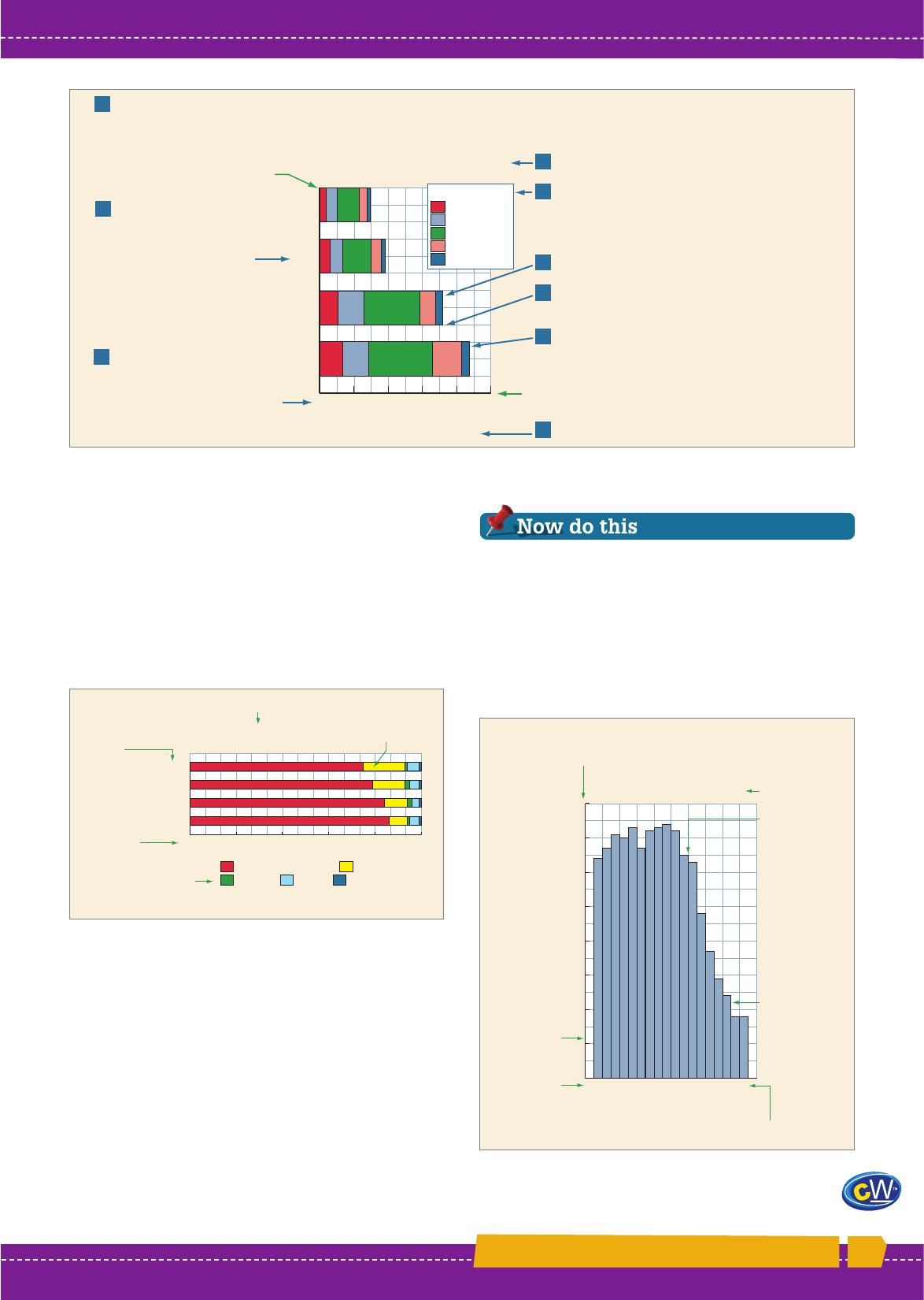
1 Draw the vertical and horizontal axes. Decide which will show categories of data (vertical for bar graph,
horizontal for column graph). Length of axes depends on number of categories, width of bars and scale selected.
9 Add source.
Vertical axis
Horizontal axis
8 Add descriptive title.
7 Add legend to explain the component parts
of each bar.
5 Divide each bar or column into its component parts.
4 Plot total values on graph. Draw bars or columns,
spread evenly along axis, with even space between
each bar or column and the next.
3 Select scale, mark scale on
axis, number each mark to create
scale line. Label axis with type of
data to be graphed and units of
measurement.
2 Decide order in which categories
will be shown (e.g. date,
importance, highest to lowest).
Label axis to name/describe
categories of data.
Perth
Brisbane
Melbourne
Sydney
Distance travelled
Source: Australian Bureau of Statistics
Number of persons (thousands)
Estimated average distance of the usual trip
to work or study in four major capital cities, 2006
Distance travelled to work
or study in capital cities
Does not travel
30 km or more
10–30 km
5–10 km
Less than 5 km
0 500 1000 1500 2000 2500
6 Outline each bar or column with fine black line and
shade in appropriate colours.
0
1
2
3
4
5
6
7
8
85+
80–84
75–79
70–74
65–69
60–64
55–59
50–54
45–49
40–44
35–39
30–34
25–29
20–24
15–19
10–14
5–9
0–4
Per cent
Descriptive title
Vertical axis shows the number of times something occurs,
e.g. the percentage of the population in each age group.
Histogram of the age distribution of
the population of Queensland, 2006
Source: Australian Bureau of Statistics
Columns are
of equal width.
There is no
gap between
columns
because the
data is
continuous,
i.e. the total
population
from birth
to death.
Numbers
are shown
on scale
line on
both vertical
and
horizontal
axes.
Horizontal axis is divided into categories, e.g. age groups.
0 20 40 60 80 100
WA
Qld
Vic
NSW
per cent
Horizontal
axis shows
scale line for
measuring
data as a
percentage.
Main type of transport used on
usual trip to work or study, 2006
Vertical
axis shows
categories
of data.
Descriptive title
Parts are shown
as a percentage.
Private motor vehicle Public transport
Bicycle Walk Other
Source: Australian Bureau of Statistics
Legend shows parts
each bar is divided into.
11.6 The main type of transport used on usual trip to work
or study, 2006. Source: 4602.0—Environmental Issues:
People’s Views and Practices, March 2006
11.7 Histogram of the age distribution of the population
of Queensland. Source: 3201.0—Population by Age
and Sex, Australian States and Territories
E
x
t
e
n
s
i
o
n
M
a
t
e
r
i
a
l
Chapter 11 MORE GRAPHS AND STATISTICS
143
1 What does Figure 11.6 show? How is it different
from Figures 11.4 and 11.5?
2 Complete Steps 5, 6 and 7 of the Steps in
interpreting a compound bar or column graph.
3 How does a histogram differ from a column graph?
4 What does Figure 11.7 show? Why does a
histogram suit what Figure 11.7 shows?
11.5 Steps in drawing a compound bar or column graph. Source: 4602.0—Environmental Issues: People’s Views and
Practices, March 2006
Percentages and compound
column and bar graphs
Compound column and bar graphs are often drawn
with the total graphed as 100. Each bar or column
is therefore the same size, and is subdivided to show
each part as a percentage of the total. This type of
graph allows accurate interpretation of the component
parts and of change between places and over time.
Histograms
Histograms are similar to column graphs, but with
numbers—in other words, a scale line—on both
the vertical and the horizontal axis. They show the
frequency or number of times that something occurs
in a particular category.
There are no gaps between the columns because
histograms show continuous data—such as numbers
of vehicles on a motorway or the population from
the youngest to the oldest person.